PROBLEM
Our client had passion and lots of ideas, but they needed help crafting a brand identity that tapped into a specific audience and their unique needs. Because they lacked focus in this area, their product also lacked specific features and functions that would set them apart from other contenders in the market.
Challenge: Create a brand identity for a cloud storage app with features and functions that solve a specific problem for the brand’s target audience.
SOLUTION
Loom was the result of intensive user research and testing that included surveys, countless usability tests, and data collection. At its core, it is a robust cloud storage web app whose versatility allows both remote teams and individuals to make creativity and collaboration a unique experience every time. Its unique note-taking features and digital whiteboarding capabilities will let users capture and share data online with others in a way that feels tangible and real.
RESEARCH + DISCOVERY
USER SURVEYS
We conducted user surveys to gauge what users were looking for in a cloud storage app. Most of our survey takers were young creative professionals or otherwise tech-savvy workers and students. They used cloud storage apps everyday for work, school, or personal storage of music and media. They shared files almost everyday on average and needed to be able to easily organize files and stay organized. They were often collaborating with coworkers online and needed a better way to utilize their files to work more efficiently and be more creative.
76.7%
share the content they upload with others
60%
use cloud storage apps DAILY
93.7%
percentage of survey takers who associate Google Drive with ‘cloud storage'
55.2%
wanted to save web content online and with others
USER PERSONAS
From this data, we created two user personas to bring focus to our target audiences. They allowed us to pinpoint specific frustrations and problems as well as tasks and goals for Loom to accomplish. They humanised our designs and kept our users at the forefront of each solution we built. Derrick represented our power user, who would utilize our Whiteboard and Note features to collaborate in real-time with his remote team. Judy was a student who would use Loom’s data organization features to keep her lecture notes and photos organized easily.

Derrick
- Ambitious and Stubborn
- Occupation: Product Designer
- Age: 28
Goals
- Share files with remote coworkers with ease
- Use collab tools like screen sharing
- Upload files and integrate with apps
Frustrations:
- Switching between apps is inefficient
- File sharing apps can be slow and laggy
- Collaborative tools don't feel intuitive
I use Dropbox everyday to share files and collaborate with my remote coworkers on my design team. I use apps like Slack and Screenhero to collab with them, but it’s annoying to have to switch back and forth between apps, and there’s no guarantee I can upload directly from Dropbox into these apps to work on them. And the collaborative tools lack the same spontaneity and creativity we would have if we were colocated. Even though we’re from all over, I want to work on projects in real time, as if we’re all in the same room together. That’s hard with lag and incompatible app integration.

Judy
- Curious and Adventurous
- Occupation: Student, barista
- Age:20
Goals:
- Share photos and videos with family
- Share web links in the same place as files
- Easy, intuitive organization of files and links
Frustrations:
- Confusing image organization in current app
- File sharing apps can be slow and laggy
- Can't save web links and shared files together
I probably take about 30-40 photos everyday, and I upload everything to iCloud. I love sharing photos with my family back index in California, and our family photo stream is my connection to them and my adventures here in college. I wish it was easier to share the videos of songs I wrote them alongside the photos. iCloud is kind of a jumble after a while. I use Google Drive to work on all my assignments and share notes with my classmates. I like being able to comment on their slides and keep everything organized in one spot, but I wish there was a way to save all our research links in the same place, too.
COMPETITIVE ANALYSIS
Using the competitor apps that our survey takers named in our user surveys, we conducted a competitive analysis to define Loom’s niche in the market. We compared Google Drive, Dropbox, and Evernote. Based on our research, we found the best way that Loom could enter the market was through a combination of strategies that helps to gain users and ultimately retain and give incentives for sharing the app with others. Requiring users to sign up for the app in order to be able to use it and also requiring their friends and colleagues to sign up for it to receive their shared files is a good strategy to keep gaining new users. Giving storage space as incentives for referrals is another way to build retention. The app itself should focus on ease of use with low barriers for entry (ie. it gets out of the user’s way and straight to business) and has great integration with major third party apps to fit easily into the user’s existing workflow.

Google Drive

Dropbox

Evernote
INFORMATION ARCHITECTURE
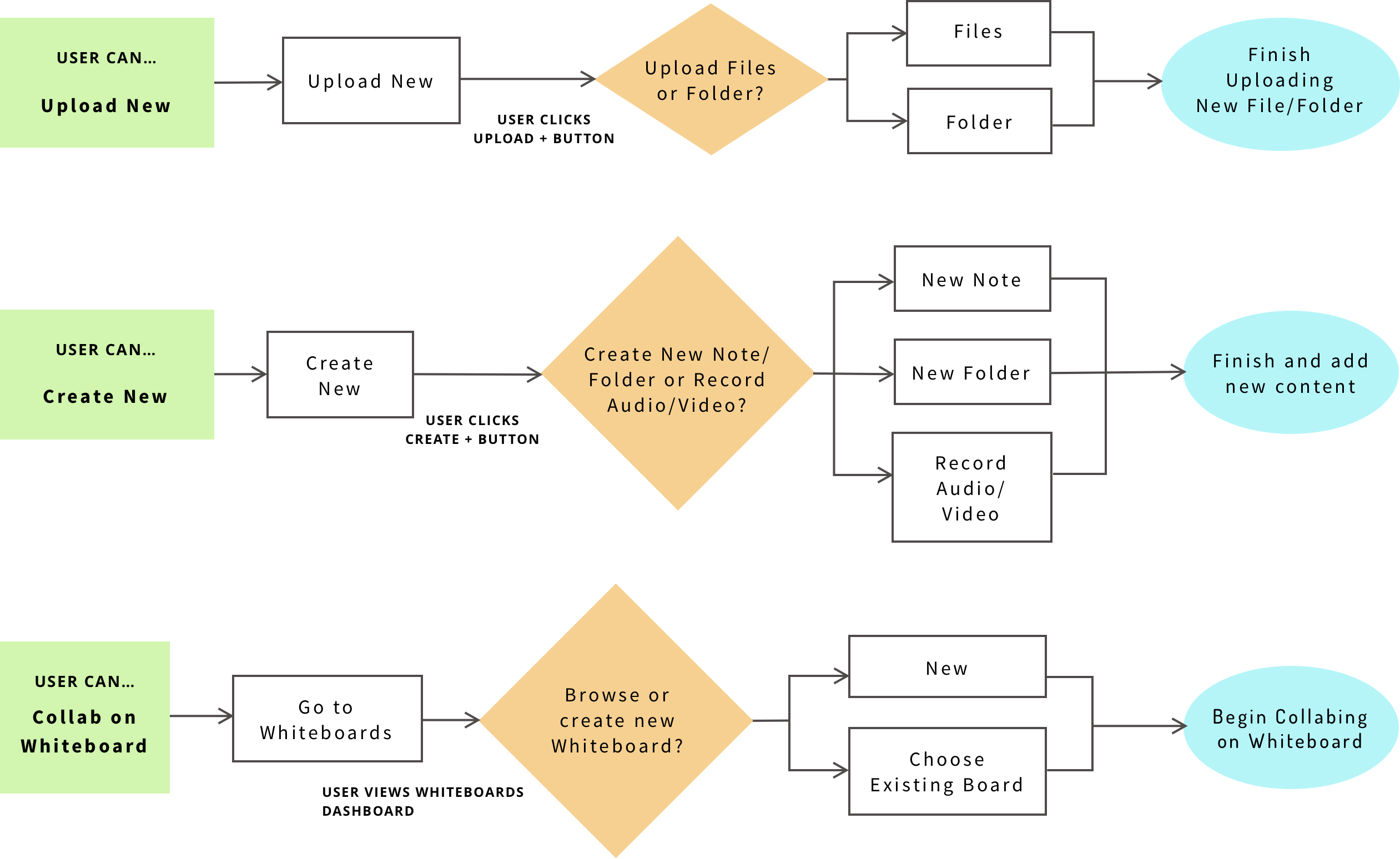
USER FLOWS
Our main focus was file organization and perfecting the uploading and sharing flow. We determined that users also needed to be able to create and share Notes. In the Whiteboard flows, it was imperative that users could communicate with their teammates and have access to whiteboarding tools no matter where they were on the infinite workspace. After defining these user tasks by priority, we used that hieararchy to structure our screens together to create a seamless, cohesive user experience in the user flows. We constantly referred back to these two documents to keep our focus and narrow our scope.
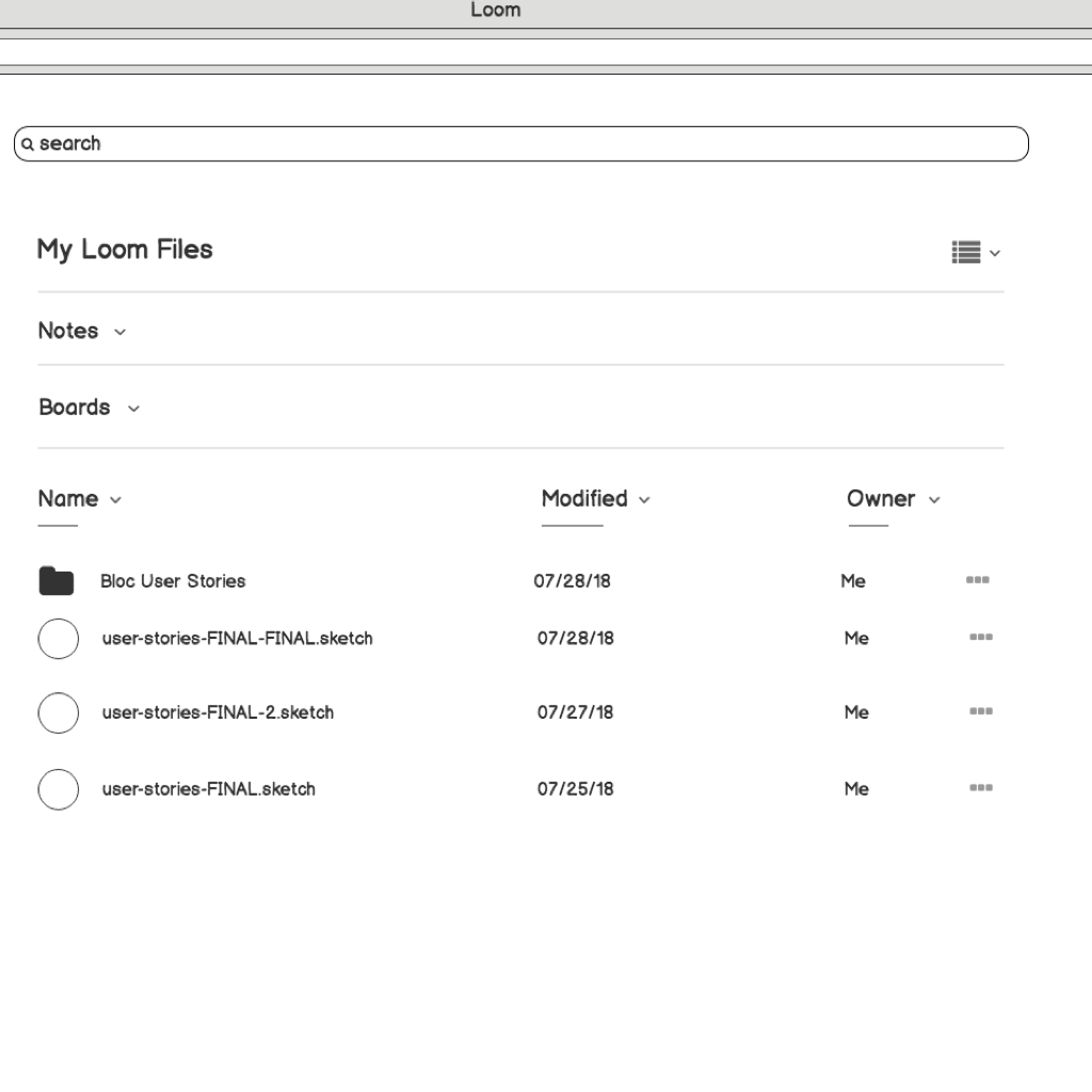
WIREFRAMES
Our main focus was file organization and perfecting the uploading and sharing flow. We determined that users also needed to be able to create and share Notes. In the Whiteboard flows, it was imperative that users could communicate with their teammates and have access to whiteboarding tools no matter where they were on the infinite workspace. After defining these user tasks by priority, we used that hieararchy to structure our screens together to create a seamless, cohesive user experience in the user flows. We constantly referred back to these two documents to keep our focus and narrow our scope.
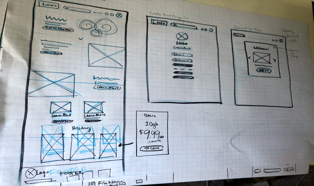
WIREFRAME SKETCH 1
WIREFRAME SKETCH 2
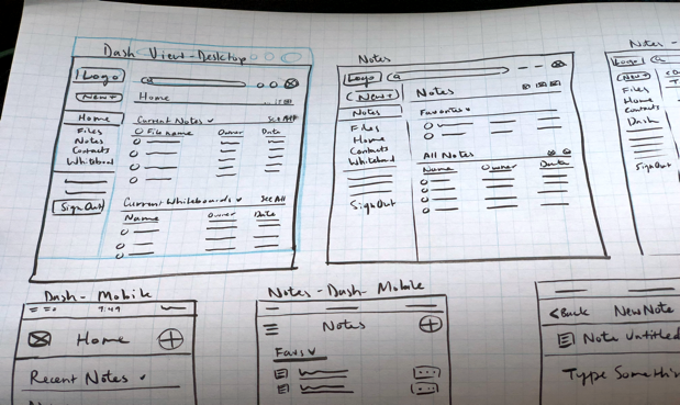
DASHBOARD LO-FI WIREFRAME 1
DASHBOARD LO-FI WIREFRAME 2
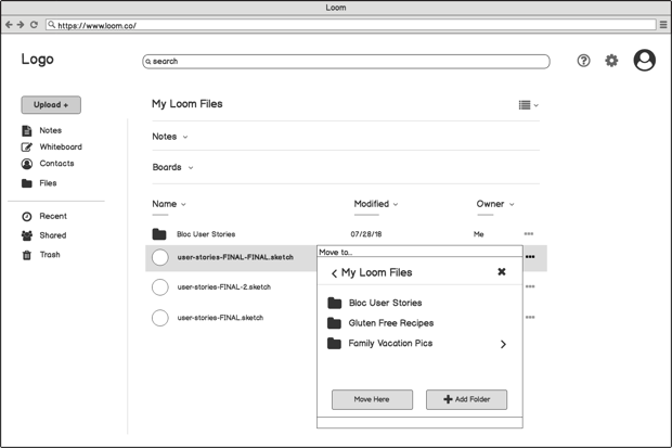
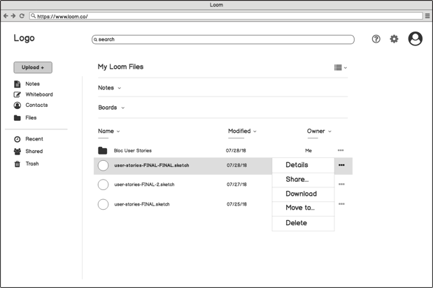
USABILITY TESTING
Armed with the initial wireframes, I began to test them with my peers, guiding them through 1-2 structured tasks that were based on high-priority user stories. It was paramount to test my user flows at this lo-fi stage because high understanding and comfort with the interface at this level meant a smooth user experience throughout the later iterations of the project. It also meant that I could make changes and iterate with user feedback quickly, without marrying myself to any one concept.
USABILITY TEST FEEDBACK
Our first round desktop usability test asked one user to move a file to a new folder. One note of feedback they gave us was about the location of certain buttons on the dash. They felt that the ellipse icons which indicated 'More Options' faded into the background too much and took too long to notice. They also felt that it made the desktop far too busy. So, on the second iteration, I removed the icons from the default view and made them a hover effect only, which both made the design cleaner and presented obvious actions to the user only when they went to look for them, highlighting a clear action path for them to take. The final example is our final hifi mockup after multiple rounds of iteration.
LOFI USER TEST 1
LOFI USER TEST 2
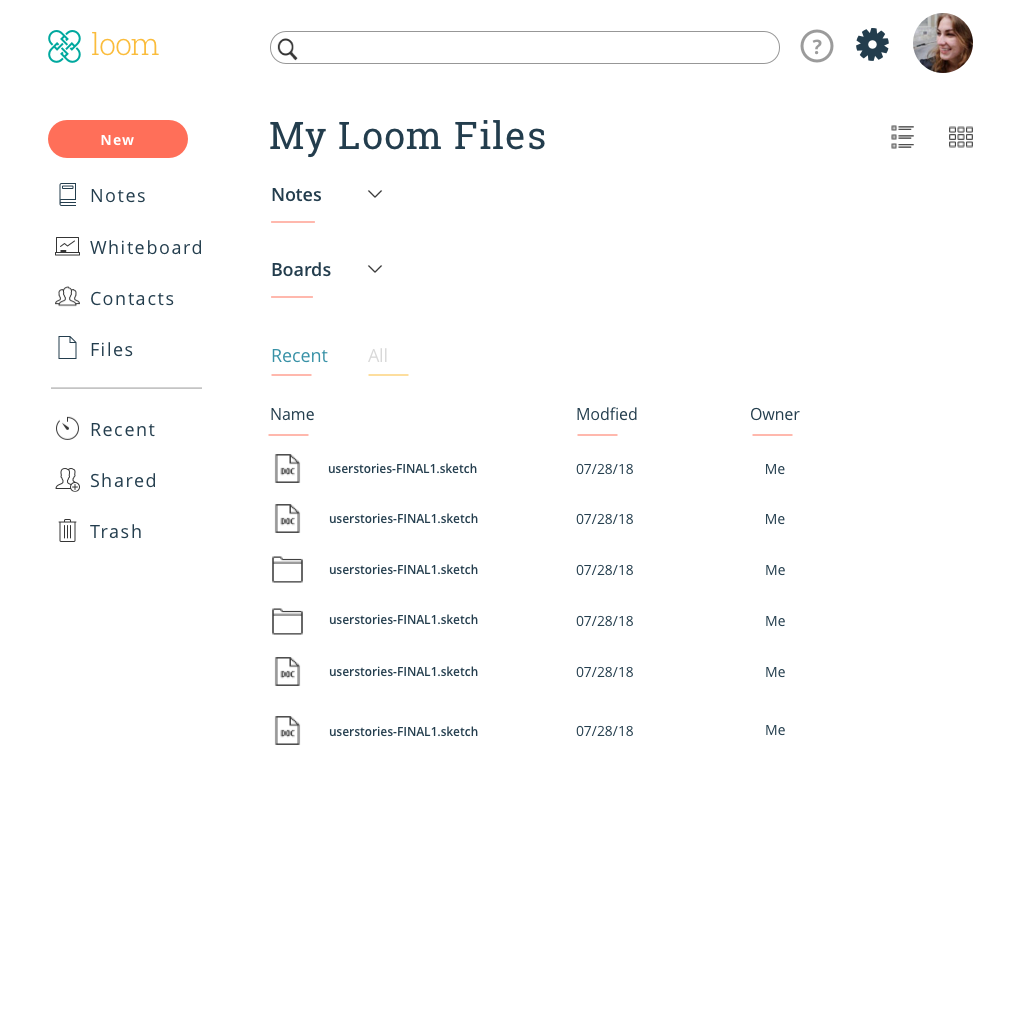
FINAL VERSION
VISUAL DESIGN
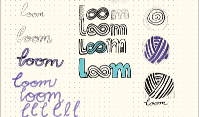
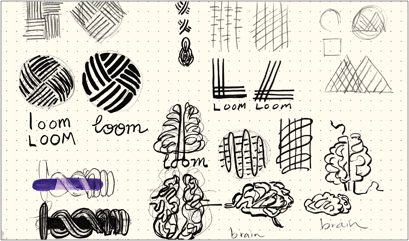
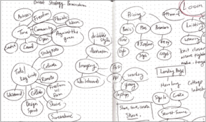
BRANDING
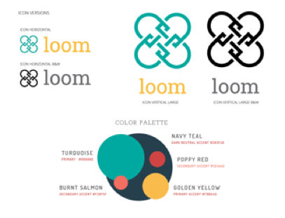
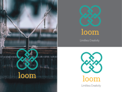
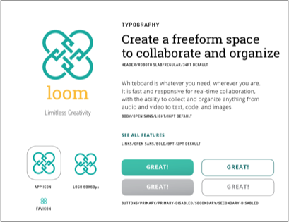
We tackled Loom’s branding through creating moodboards and brain maps. Loom evoked a sense of heritage and craftsmanship, harking back to an era where artisans worked together in communities for a single purpose. We also wanted to feel casual and fun, evoking the fast-paced work environments of our modern day offices and coworking spaces. We combined woven textures with bright but restrained color palettes to achieve this casual, modern heritage feel for the branding. In regards to typography, Roboto Slab decorated our headers and callouts with its soft but bold serifs. Open Sans laid out the meat and guts of our interface with simple rounded curves and high readability. Increasing the line spacing helped make Loom feel modern and open.
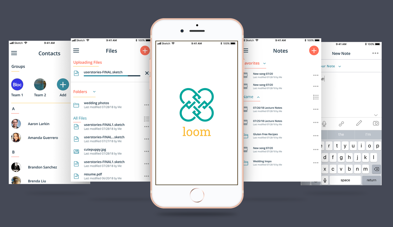
MOCKUPS
Once the basic structure of the app was finalized, it was time to rig a mockup to be able to test our hypotheses on real people. In the mockup stage, we developed our wireframes digitally with Balsamiq and used InVision to create clickable prototypes. It was here that we began to face some real challenges. As our mockups came to life, we had to revisit some of our user flows and reorganize steps and tasks to streamline our design. Where something might have made sense in the wireframe alone, once it had to be interacted with, the flow didn’t make sense or it was missing transitional pages in between.

LO-FI VS HI-FI UPLOAD PROGRESS
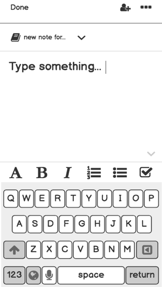
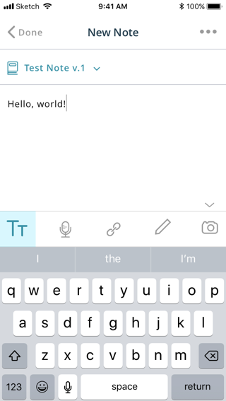
LO-FI VS HI-FI NEW NOTE SCREEN
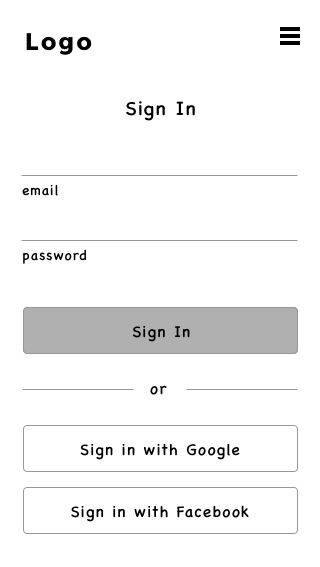
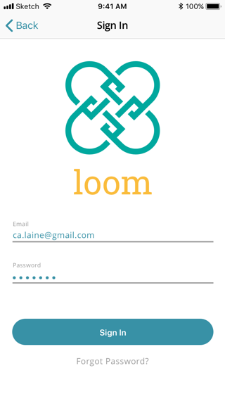
LO-FI VS HI-FI SIGN-IN SCREEN
HI-FI PROTOTYPE
This was the hardest step. Creating the final look of our design was meticulous work, but finally validating our hypotheses about our visual design choices with actual users was even harder. Not only did we have to study how users used our app, but we had to defend our design choices time and time again as they were questioned and challenged in preference tests and usability tests. Each time, though, we arrived at better iterations that struck closer to the mark of what Loom needed to become. Our testers helped us target weak spots in our design like poor icon design or unclear information hierarchy.
USER FEEDBACK #1
One user called attention to our previous use of a bright, poppy orange. It was too close to red, which they felt indicated a destructive behavior or warning. Quite the opposite from the message we were trying to convey! By lightening the orange-red to a brighter orange, it felt less punitive to click on those same buttons.
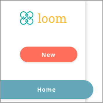
BEFORE
AFTER
BEFORE
AFTER
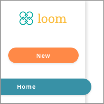
USER FEEDBACK #2
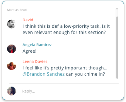
One user helped us make our comments windows in Whiteboards wider to reflect their frustrating experience working in other online collaborative platforms. They noted that when making comments on someone else’s work, the comments are rarely short sentences. On average they felt that feedback was usually one or two longer sentences. After re-testing the changes, we agreed that the new window was much more comfortable to read.
CONCLUSION
CHALLENGES
STAYING ORGANIZED
We learned that creating a comprehensive design system was integral to being able to design efficiently and quickly. This was a definite challenge. Learning to think in this highly organized manner from the get-go was very difficult, especially in the design stage when it was easy to get lost in building components and not stopping to organize layers and symbols along the way. Sketch and Figma both make it easy to make changes across artboards using symbols and styles, but they require forethought to execute well.
SEEING THE BIG PICTURE
Another challenge we found in the design stage was keeping the high-priority user stories in focus as we dove deep into the granular details of our prototypes. It was easy to fully build out low-priority tasks in abundance, but it was even easier to let complex high-priority tasks stay half-baked and underdeveloped. We found ourselves constantly reiterating in response to not only usability tests but flaws that kept arising from building our prototypes. This also goes back to staying organized; if we had stayed that way from the beginning, then reiterating would have been a much faster process.
WHAT WE ACHIEVED
Ultimately, we felt that Loom succeeded in communicating its brand identity and staying consistent design-wise across both desktop and mobile. We highlighted efficiency and ease of use as core facets of our design and we felt that was successful as well. Users in our usability tests all felt that the tasks were easy to carry out and the user interface design was intuitive. Many of their verbal thought processes boiled down to, “It makes sense that this would be here.”